This post was originally posted on the accuRx company blog
Why accessibility is important to us at accuRx
As a user-focused company, we spend a lot of time ensuring that our products work for our target audience (see this blog post on user research) and patients are a massive part of this. Whereas staff in GP surgeries can typically have more predictable tech setups and usability needs, patients can have a much wider range of accessibility needs, and access our products through many different setups. Within the last year, we have drastically increased the number of patient-facing products we have, and so it’s more important than ever for us that our products are accessible for every patient, regardless of how tech-savvy they are or what device they are using.
Tackling accessibility in our code
Anyone working on frontend code at accuRx (including our 6 dedicated frontend engineers) has access to our ever-growing component library, which allows us to quickly and easily plug-in pre-made components. This means that if we find any accessibility issues with a component, we can easily fix this across all the webpages, and it also means we can automatically enforce things that often trip up engineers, such as labelling grouped form inputs correctly.
We use a variety of automatic tools to check the accessibility of our pages, including the automatic linter warnings from the eslint-jsx-a11y plugin and the accessibility plugin on Storybook where we host our component library. But it’s also still very important for us to consider the accessibility of each of the pages in our products and think overall about how easy the UI is to use.
We also ensure that patient-facing flows are tested using a screen-reader and using only a keyboard, which allows us to pick out any issues in advance before they go in front of users. Just a few months ago we had a user who was completely blind come to speak to us about how he used our product to book his COVID-19 vaccine quickly and easily using a screen-reader on his mobile phone.
Keeping the POUR principles in mind
While people’s accessibility barriers can vary a lot, there are some key functional groups that we can consider when looking at ensuring the general accessibility of a product. The POUR principles are four high-level principles to consider when designing and building a product — Perceivable, Operable, Understandable, and Robust
Perceivable
We use a small colour-palette for most of our user interfaces, and make sure that we’ve tested out the colour contrast across pages using tools such as Lighthouse
Most of our interfaces are very text-based, and any images that convey important information have labels and alternative text which can be accessed from assistive technologies. Having interfaces text-based also means that people who have their systems set to use larger text are able to do so
Operable
We ensure that we’re using semantic HTML for all elements on the page, such as links, buttons, form inputs etc. One of the ways we catch any discrepancies in this, is by using custom wrappers around our UI testing library (React Testing Library) which purposely make users select elements using their roles and labels — this means that we can easily catch when something is using the wrong HTML element, or is missing correct labelling
/**
* Used to test for existence of a checkbox
* @param checkboxLabel The accessible name for the checkbox aka label
* */

export const getCheckboxInput = (checkboxLabel: string | RegExp): HTMLElement => {
return container.getByRole("checkbox", { name: checkboxLabel });
};
Using HTML in this way also means that we can rely on the native handling for keyboard accessibility and element querying, without having to manually add handlers onto things and inadvertently missing something that would make the UI inaccessible for a certain interaction
<input type="file" accept="image/*" id="fileUpload" data-testid="fileUpload" onChange={uploadFile}/>Here we’re using the native file upload, which will automatically handle things like validating file types automatically and opens up correctly with native popups depending on whether people are on desktop or mobile
Understandable
Using a component library means that there is consistent UI across our products, so it’s easier to understand what different UI elements will do as you move across the products

Here we have standardised colours for our buttons so users always know what the primary and secondary actions are easily
We also use simple language when writing copy for our products — this is important for the inclusion of people of varying reading levels, and also means that people using translate options on their browsers are more likely to get a translation that makes sense to them

Robust
Since our users use such a variety of devices and operating systems, we always ensure that our webpages work on Internet Explorer 11, which a lot of our GP practice users still use by default. Since we aim to deliver very no-frills code for the frontend, this functionality is often there by default, and we’re able to use polyfills to fill in any newer functions we’re using.
While most of our pages have quite simple 1-column layouts, we also make sure that our multi-column layouts are tested on older browsers as well
For patient-facing products, we have a mobile-first approach to the designs — as users receive these links via SMS, it’s possible that they click the link and complete the full flow on their mobiles, so we make sure that the pages are optimised for this and that we’ve tested the UI on a very small mobile screen
Another common flow is for users to receive an SMS link and try typing it manually on the computer. This can often result in people landing on the base URL homepage as opposed to their unique link, so we try to guide them to input the correct unique code, as opposed to having them try to figure out where they have gone wrong
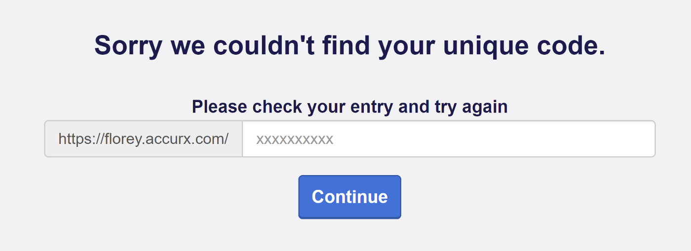
Our base URL for patient-facing flows allows users to just have to type in their unique code again rather than the whole URL
Continuing to improve accessibility
The above are some examples of how we’ve approached applying the POUR principles in our current products at accuRx, but as we spin up new products and work with new groups of users (such as moving from GP-focused products to also having products in hospitals) we continually have new and interesting accessibility challenges to solve, particularly in terms of how we tackle visual hierarchy for our busy users with big lists of tasks.
We’d love to hear from people tackling similar problems in the comments, and if you’re interested in helping us build accessible products that solve communication barriers in healthcare, then check out the available roles at accuRx!